day3_packages <- c("estimatr", "ggeffects", "marginaleffects",
                   "modelsummary", "effects", "gtsummary", "gt",
                   "ggthemes", "panelr", "remotes",
                   "GGally")

install.packages(day3_packages)

remotes::install_github("kjhealy/gssr")Day 3: Quantities of Interest
In the final day of the workshop, we’ll really be slowing things down. In Days 1 and 2, we explored a variety of complex visualizations and walked through the grammar of graphics in some detail (Wickham, Navarro, and Pedersen 2023; Wilkinson 2005). In Day 3, we’ll get a bit more pragmatic and address a topic that should be of interest to every population researcher out there: how can we visualize the results of the statistical models we fit?
As in Days 1 and 2, you can engage with course materials via two channels:
By following the
day3.Rscript file. This file is available in the companion repository for PopAging DataViz.1By working your through the
.htmlpage you are currently on.
A Reminder About Packages (Click to Expand)
If renv::restore() is not working for you, you can install Day 3 packages by executing the following code:
Fitting Models, Visualizing Results
Data
Here are the datasets we will briefly work with today.
| Dataset | Details |
|---|---|
gapminder_2007 |
Country-level data from 2007. Data comes from the gapminder package — but excludes observations from Oceania. |
wage_panelr |
Earnings trajectories of around 600 individuals featured in the Panel Study of Income Dynamics. Data drawn from the panelr package. |
gss_2010 |
Data from the 2010 General Social Survey in the United States. Data drawn from the gssr package. |
If you are having issues cloning (or downloading files or folders from) the source repository, you can access the .RData file by:
- Executing the following code in your console or editor:
# Loading the Day 3 .RData file

load(url("https://github.com/sakeefkarim/popagingdataviz_workshop/blob/main/data/day3.RData?raw=true"))
Or downloading the
.RDatafile directly:
Exploring Our Data
We’ve already seen how skimr and summarytools can help us explore our data. Here’s another helpful library—i.e., GGally—that we can use to illuminate relationships among variables in our input data.
library(GGally)

ggpairs(gapminder_2007 %>% select(2:5),
        mapping = aes(colour = continent))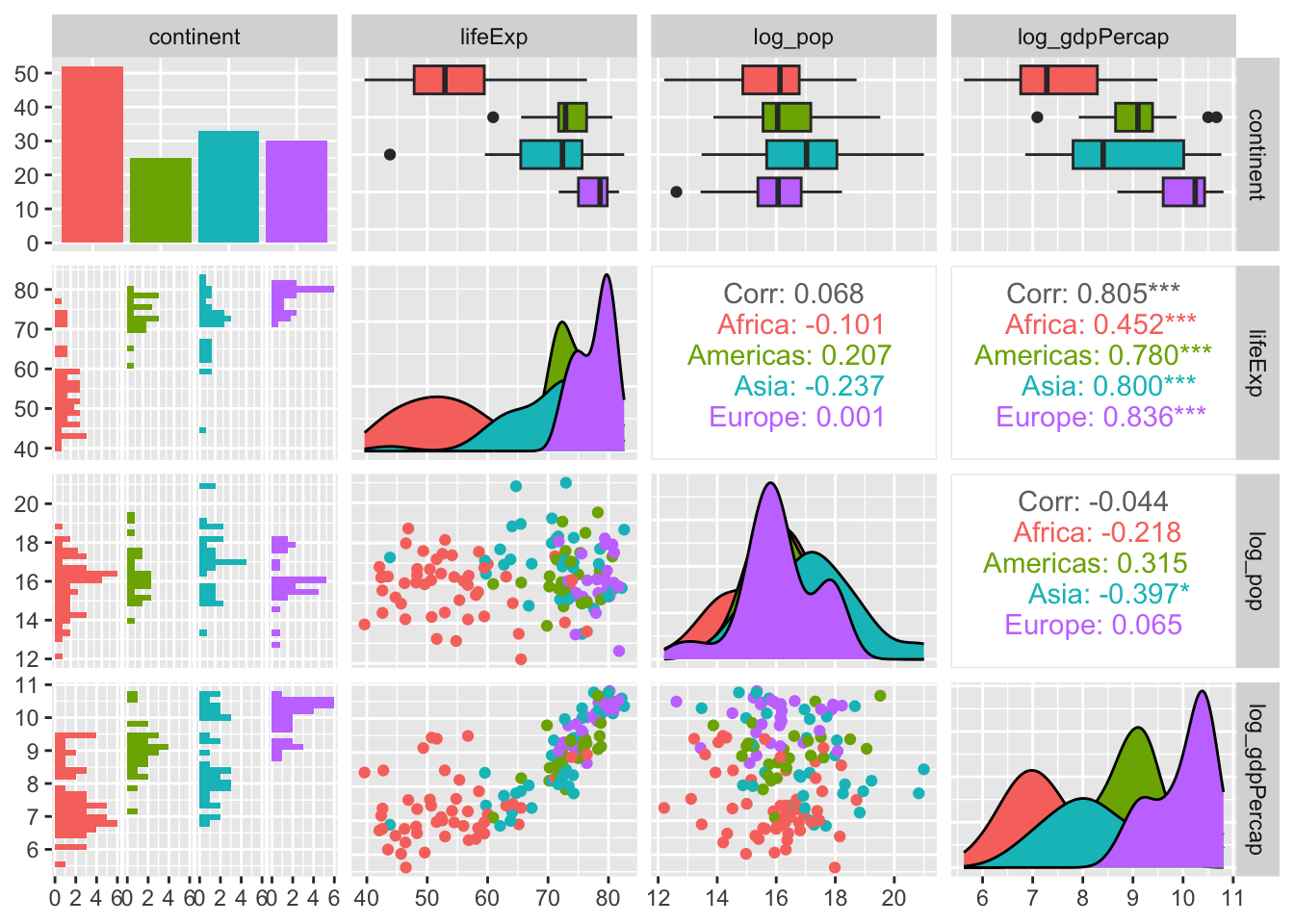
A Basic Linear Model
Using the gapminder_2007 data frame, let’s regress life expectancy on the following predictors: log_pop, continent and log_gdpPercap.
mod_gapminder_1 <- lm(lifeExp ~ log_pop + log_gdpPercap + continent,
                      data = gapminder_2007)
After fitting our model, let’s use functions from gtsummary, modelsummary or broom to look at our results.
Caveat Emptor
The models produced here are simply for illustrative purposes. To wit, they offer little inferential or predictive power — and are undoubtedly misspecified.
tbl_regression(mod_gapminder_1)| Characteristic | Beta | 95% CI | p-value |
|---|---|---|---|
| log_pop | 0.04 | -0.66, 0.74 | >0.9 |
| log_gdpPercap | 4.6 | 3.6, 5.7 | <0.001 |
| continent | |||
| Africa | — | — | |
| Americas | 12 | 8.3, 15 | <0.001 |
| Asia | 10 | 6.9, 13 | <0.001 |
| Europe | 11 | 7.4, 15 | <0.001 |
| Abbreviation: CI = Confidence Interval | |||
modelsummary(mod_gapminder_1)| (1) | |
|---|---|
| (Intercept) | 19.388 |
| (7.502) | |
| log_pop | 0.042 |
| (0.353) | |
| log_gdpPercap | 4.643 |
| (0.540) | |
| continentAmericas | 11.654 |
| (1.700) | |
| continentAsia | 10.049 |
| (1.584) | |
| continentEurope | 11.229 |
| (1.934) | |
| Num.Obs. | 140 |
| R2 | 0.763 |
| R2 Adj. | 0.754 |
| AIC | 905.6 |
| BIC | 926.2 |
| Log.Lik. | -445.797 |
| F | 86.276 |
| RMSE | 5.84 |
mod_gapminder_1 %>% tidy()# A tibble: 6 × 5
term estimate std.error statistic p.value
<chr> <dbl> <dbl> <dbl> <dbl>
1 (Intercept) 19.4 7.50 2.58 1.08e- 2
2 log_pop 0.0417 0.353 0.118 9.06e- 1
3 log_gdpPercap 4.64 0.540 8.60 1.86e-14
4 continentAmericas 11.7 1.70 6.86 2.35e-10
5 continentAsia 10.0 1.58 6.34 3.20e- 9
6 continentEurope 11.2 1.93 5.81 4.42e- 8These functions (and libraries) are convenient ways to review model results or begin the process of building a regression table. However, visual summaries are particularly useful for demystifying complex (and at times inscrutable) statistical models.
With that in mind, here’s a simple way we can use broom::tidy() and ggplot2 to visualize the results of our model while highlighting our parameters of interest.
mod_gapminder_1 %>% tidy(conf.int = TRUE) %>%
                    # Zeroing in on variables of interest:
                    filter(str_detect(term, "log")) %>%
                    ggplot() +
                    geom_pointrange(mapping = aes(x = estimate,
                                                  y = term,
                                                  xmin = conf.low,
                                                  xmax = conf.high))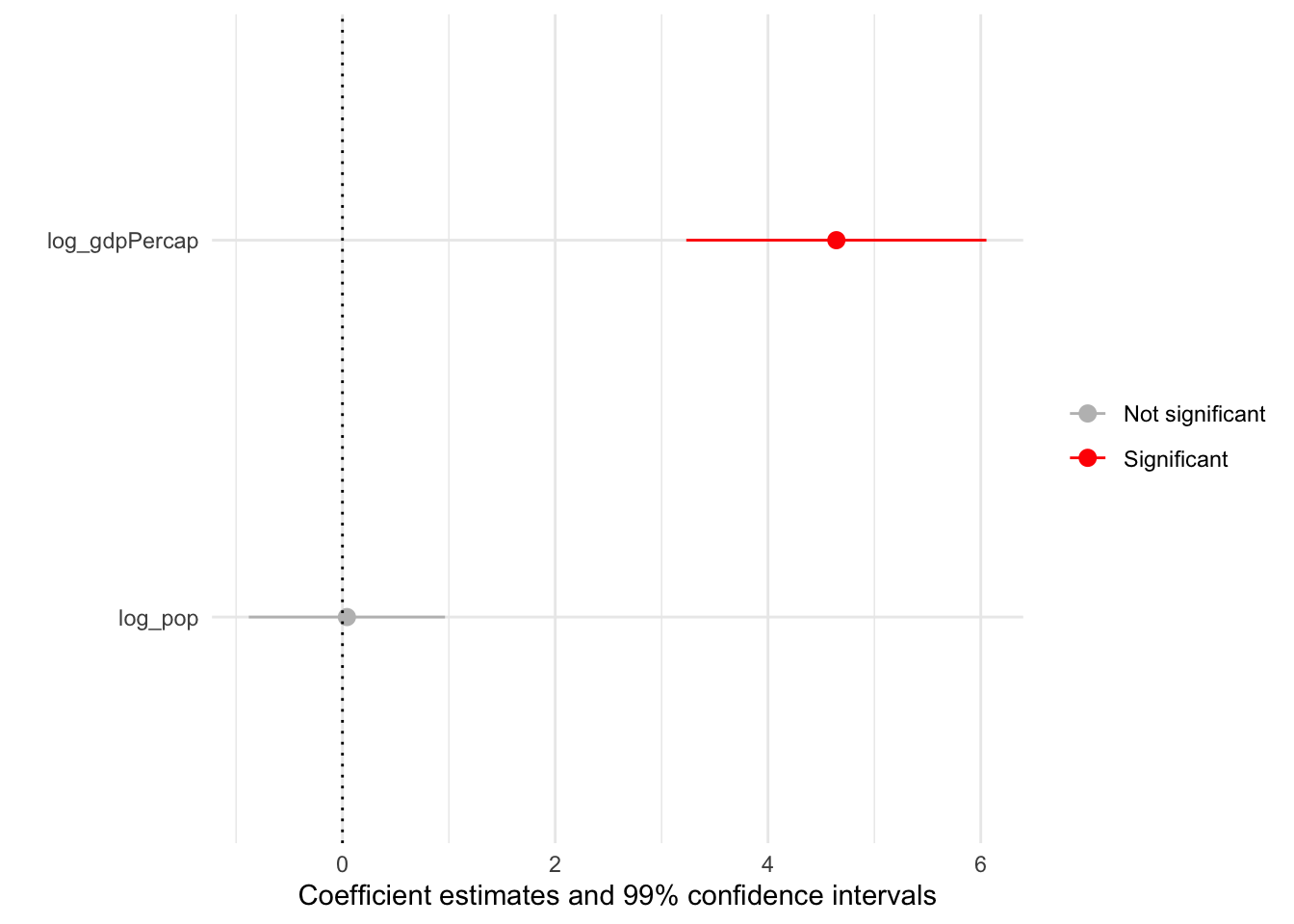
Quick Exercise (Click to Expand)
Spend the next 10 minutes manipulating this basic coefficient plot using some of the skills you’ve developed during PopAging DataViz.
Coefficient Plots via modelplot()
Producing coefficient plots manually gives us fine control — but may take a fair bit of time as well (depending on the complexity of our models). Thankfully, the modelplot() function from modelsummary can streamline the process:
modelplot(mod_gapminder_1,
          # Omitting specific variables (e.g., controls,
          # fixed effects etc.)
          coef_omit = "Interc|contin",
          # 99% confidence intervals:
          conf_level = 0.99) +
geom_vline(xintercept = 0,
           linetype = "dotted") +
    # Shading in "pointranges" based on significance level:
aes(colour = ifelse(p.value < 0.01, "Significant", "Not significant")) +
scale_colour_manual(values = c("grey", "red"))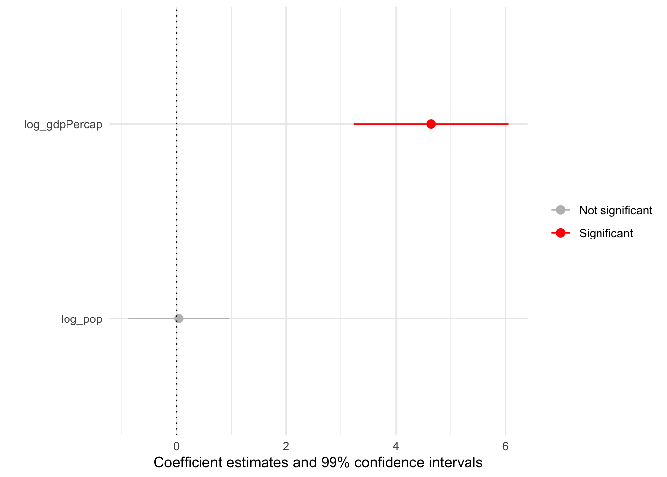
To showcase the utility of modelplot(), let’s fit a model that’s a bit more complex. To do so, we’ll use the wage_panelr dataset as well as the lm_robust() function from estimatr. For some context, here’s a summary of wage_panelr:
wage_panelr %>% select(where(is.numeric)) %>% ggpairs()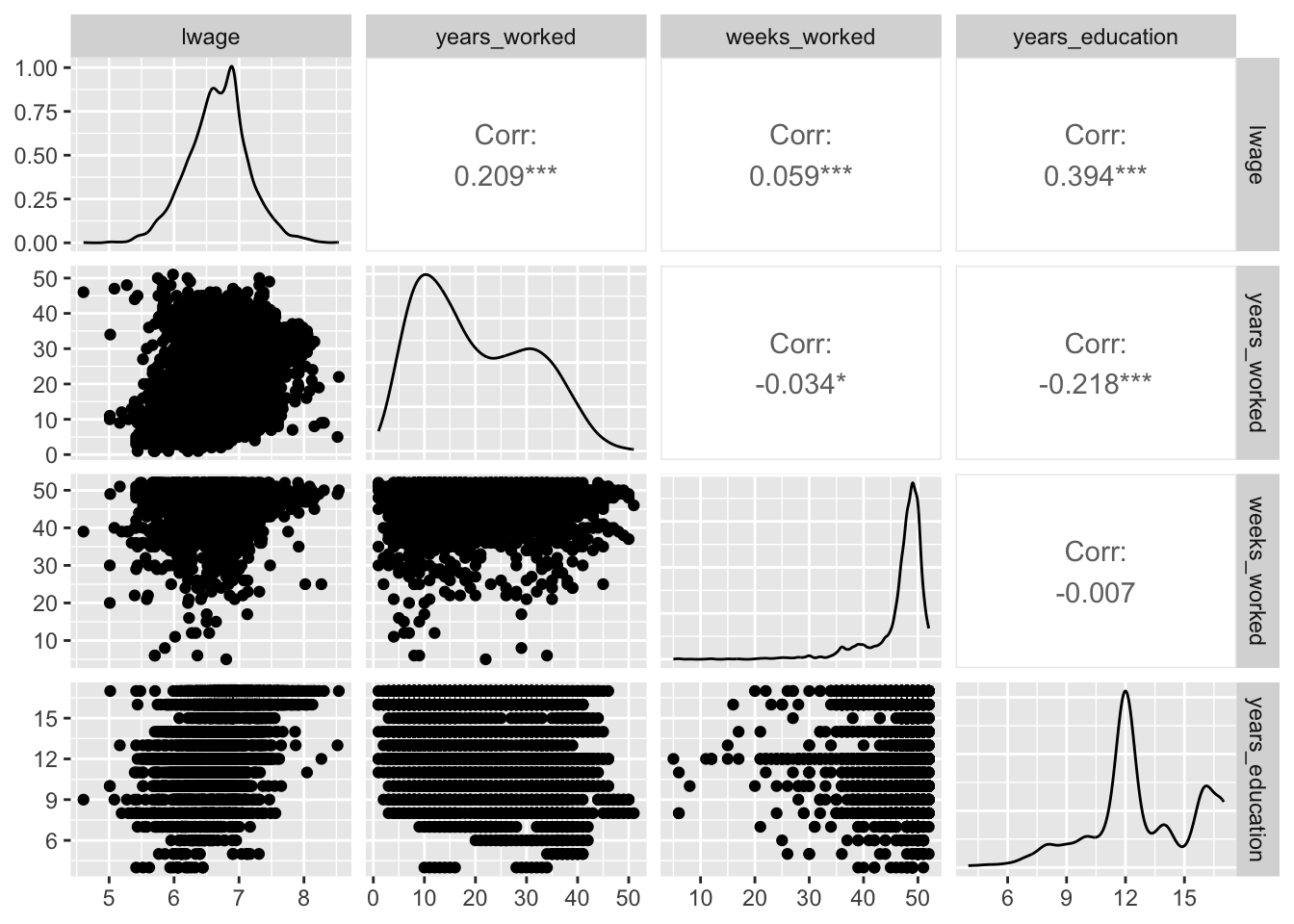
Now, let’s regress the log of individual wages on a series of covariates while clustering standard errors at the respondent-level2:
mod_wages_1 <- lm_robust(lwage ~ years_worked + female +
                         black + blue_collar +south + union +
                         manufacturing + wave,
                         data = wage_panelr,
                         clusters = id,
                         # Produces robust clustered SEs (via the
                         # Delta method - as in Stata):
                         se_type = "stata")
Having stored our results in mod_wages_1, let’s summarize our model graphically:
# Labels for coefficients:

wages_labels <- c("manufacturing1" = "Manufacturing",
                  "union1" = 'Union Member',
                  "south1" = "Southerner",
                  "black1" = "Black",
                  "female1" = "Female",
                  "years_worked" = "Years in Workforce",
                  "blue_collar1" = "Blue Collar Worker")

mod_wages_1 %>% modelplot(conf_level = 0.99,
                          #String search:
                          coef_omit = 'Interc|wave',
                          colour = "red",
                         # Renaming coefficients:
                          coef_map = wages_labels) +
              theme_bw(base_family = "Inconsolata") +
              # Adding reference point for "non-significant" finding:
              geom_vline(xintercept = 0,
                         linetype = "dashed") +
              labs(x = "Coefficient Estimates",
                   title = "Predicting the Log of Wages",
subtitle = "With 99% Confidence Intervals") 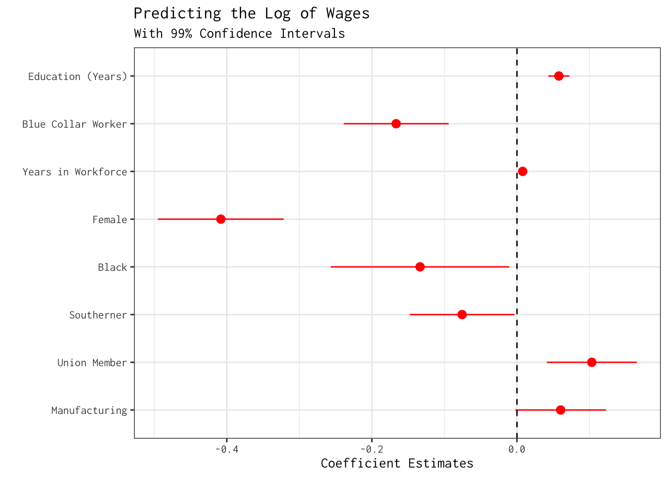
As we fine-tune our model, we may be interested in testing whether the sex differences we uncovered in mod_wages_1 would persist if additional background variables were adjusted. With this in mind, let’s include an additional regressor on the right-hand side: years_education (i.e.,years of schooling).
# Additional control:

mod_wages_2 <- lm_robust(lwage ~ years_worked + years_education +
                         female + black +  blue_collar + south + union +
                         manufacturing + wave,
                         data = wage_panelr,
                         clusters = id,
                         se_type = "stata")

# Adjusting our labels:

wages_labels <- c(wages_labels, "years_education" = "Education (Years)")

mod_wages_2 %>% modelplot(conf_level = 0.99,
                          coef_omit = 'Interc|wave',
                          colour = "red",
                          coef_map = wages_labels) +
                theme_bw(base_family = "Inconsolata") +
                geom_vline(xintercept = 0,
                           linetype = "dashed") +
                labs(x = "Coefficient Estimates",
                     title = "Predicting the Log of Wages",
subtitle = "With 99% Confidence Intervals") 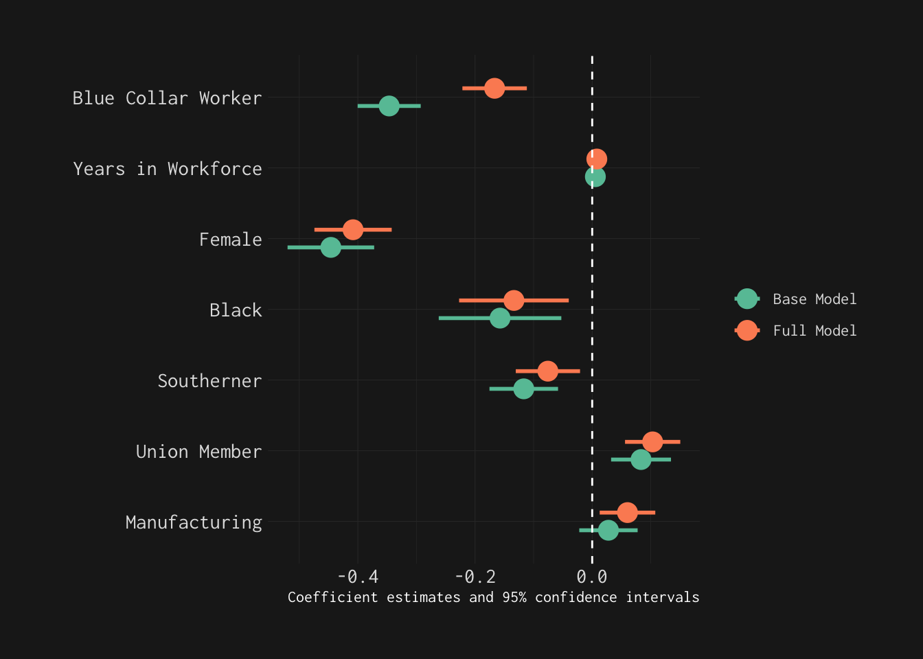
Now, let’s explicitly—and visually—compare these models using modelplot().
wage_models <- list("Base Model" = mod_wages_1,
                    "Full Model" = mod_wages_2)

wage_models %>% modelplot(coef_omit = 'Interc|wave|edu',
                          size = 1,
                          linewidth = 1,
                          coef_map = wages_labels) +
                # Adjusting colour scale:
                scale_colour_brewer(palette = "Set2") +
                # From ggthemes
                theme_modern_rc(base_family = "Inconsolata") +
                theme(legend.title = element_blank()) +
                geom_vline(xintercept = 0,
                           colour = "white",
                           linetype = "dashed")
# Using facets

rev(wage_models) %>% modelplot(coef_omit = 'Interc|wave|edu',
                               # Matches arguments for geom_pointrange()
                               size = 1,
                               linewidth = 1,
                               coef_map = wages_labels,
                               colour = "skyblue",
                               facet = TRUE) +
  theme_bw(base_family = "Inconsolata") +
  theme(legend.title = element_blank(),
        strip.text.y = element_text(angle = 0)) +
  geom_vline(xintercept = 0,
             linetype = "dashed")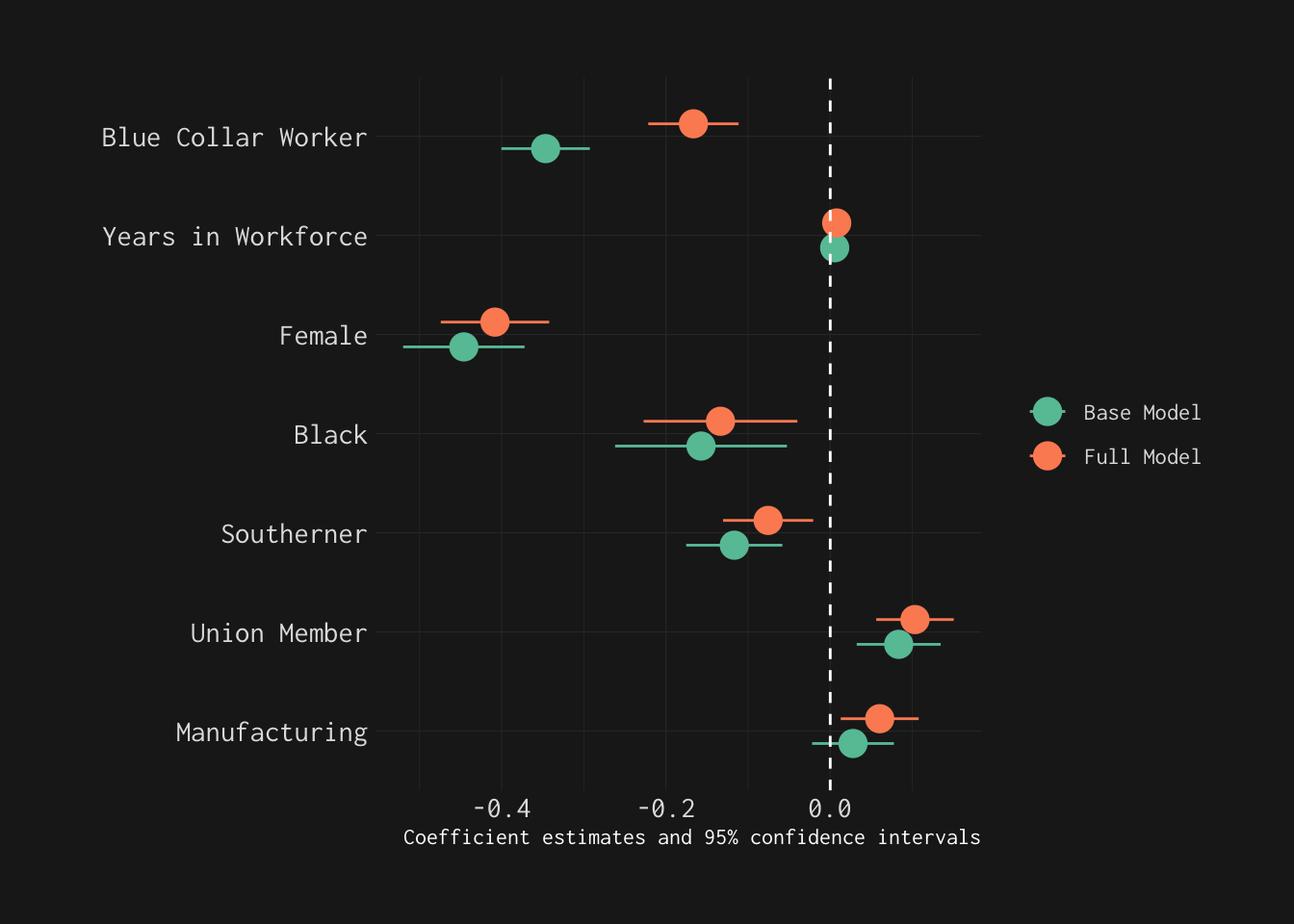
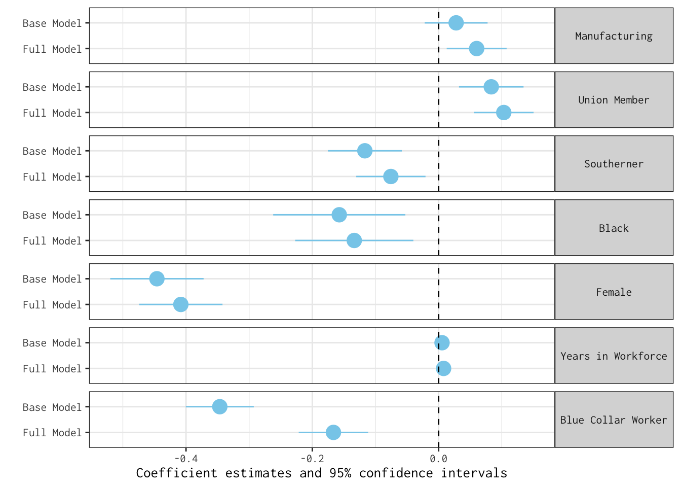
As these plots lay bare, introducing an additional covariate (years_education) does little to change our story.
Adjusted Predictions, Marginal Effects
Adjusted Predictions
There is a rather large body of scholarship detailing the importance of predictions as tools for clarifying model results — especially when our outcomes are discrete or interactions are brought into our statistical ecosystems (see Arel-Bundock 2024; Long and Mustillo 2021; Mize 2019). That is, however, a story for another day. For now, let’s use two wonderful libraries—ggeffects and marginaleffects—to visualize model predictions.
To do so, let’s fit a slightly more complicated version of mod_gapminder_1. Specifically, let’s allow continent to moderate the relationship between per capita GDP (logged) and life expectancy. We can specify this model as follows:
mod_gapminder_2 <- lm(lifeExp ~ log_pop + continent*log_gdpPercap,
                      data = gapminder_2007)
Now, let’s summarize our results graphically.
Here’s how we can visualize predictions using ggeffects:
ggeffect(mod_gapminder_2,
         # Predicted life expectancy at logged GDP per capita of 6 to 11
         # for countries in Europe and Africa:
         terms = c("log_gdpPercap [6:11]",
                   "continent [Europe, Africa]")) %>%
         plot() +
         labs(title = "Predicted Values of Life Expectancy",
              x = "Log of Per Capita GDP",
              y = "Life Expectancy (Years)",
              fill = "",
              colour = "") +
          theme_ggeffects(base_family = "IBM Plex Sans") +
          scale_color_economist() +
          scale_fill_economist() +
          theme(legend.position = "bottom") +
          # Overriding default alpha of confidence intervals:
          guides(fill = guide_legend(override.aes =
                                       list(alpha = 0.35)))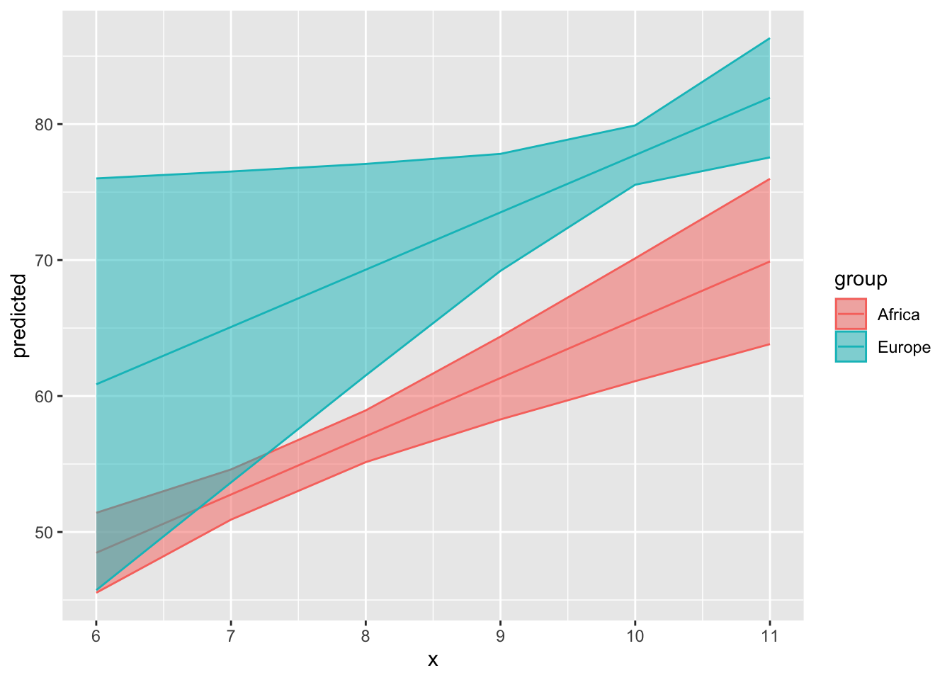
The Slightly Longer Route
We can turn the results of ggeffect() into a tibble that we feed into ggplot2:
mod_gapminder_2 %>% ggeffect(terms = c("log_gdpPercap [6:11]",
                                       "continent [Europe, Africa]")) %>%
                    as_tibble() %>%
                    ggplot(mapping = aes(x = x,
                                         y = predicted,
                                         ymin = conf.low,
                                         ymax = conf.high,
                                         # group corresponds to discrete term:
                                         colour = group,
                                         fill = group)) +
                    geom_line() +
                    # For confidence intervals:
geom_ribbon(alpha = 0.5) 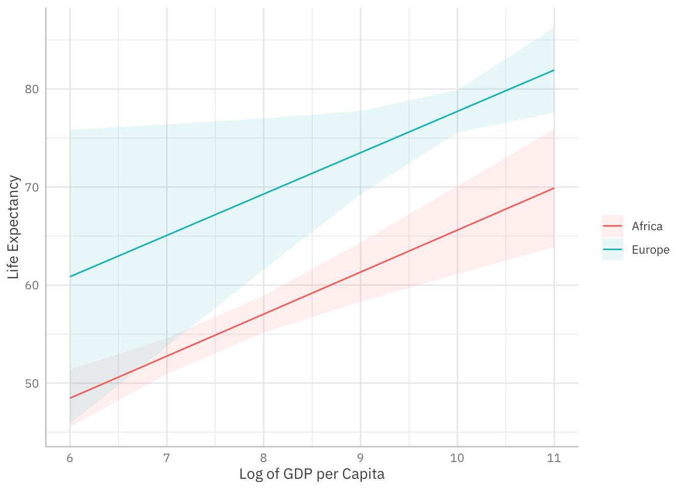
Here’s how we can use marginaleffects to visualize model predictions:
plot_predictions(mod_gapminder_2,
                 condition = list("log_gdpPercap" = 6:11,
                                  "continent" = c("Africa", "Europe"))) +
theme_ggeffects(base_family = "IBM Plex Sans") +
labs(fill = "", colour = "",
     x = "Log of GDP per Capita",
     y = "Life Expectancy")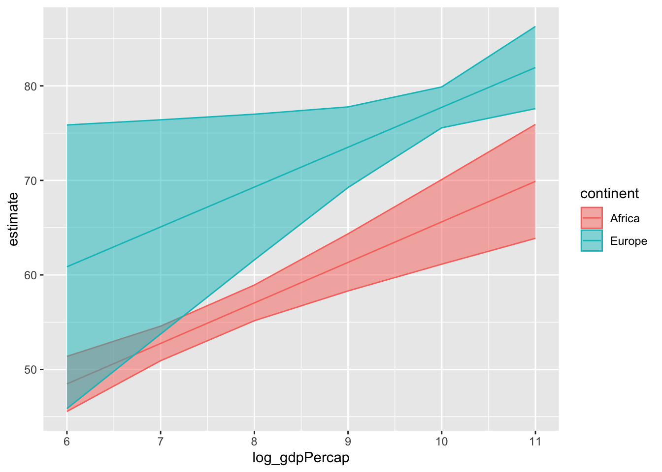
The Slightly Longer Route
We can turn the results of avg_predictions() into a tibble that we feed into ggplot2:
avg_predictions(mod_gapminder_2,
                variables = list(log_gdpPercap = c(6:11),
                                 continent = c("Africa", "Europe"))) %>%
as_tibble() %>%
ggplot(mapping = aes(x = log_gdpPercap,
                     y = estimate,
                     ymin = conf.low,
                     ymax = conf.high,
                     colour = continent,
                     fill = continent)) +
geom_line() +
geom_ribbon(alpha = 0.5) 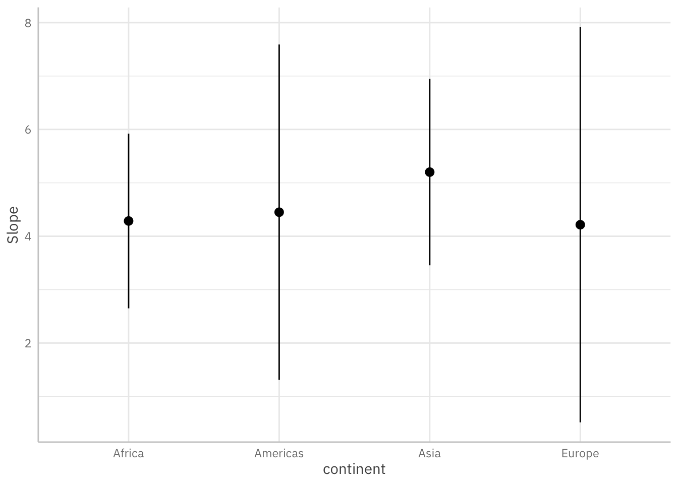
Average Marginal Effects
As Arel-Bundock (2024) explains, a marginal effect—or slope—is “the association between a change in a predictor \(X\), and a change in the response \(Y\), estimated at specific values of the covariates.” Across the social and behavioural sciences, this is often the quantity of substantive interest. Average marginal effects allow us to report the average of all unit-level “slopes.”
Below, we use a few lines of code to estimate and visualize the average marginal effects3 associated with a key regressor (log_gdpPercap) across levels of the continent variable.
plot_slopes(mod_gapminder_2,
            variables = "log_gdpPercap",
            condition = "continent") +
theme_ggeffects(base_family = "IBM Plex Sans")
Quick Exercise (Click to Expand)
This is how you would estimate average marginal effects using the avg_slopes() function:
avg_slopes(mod_gapminder_2,
           # Focal variable:
           variables = "log_gdpPercap",
           # Across levels of ...
           by = "continent")
 continent Estimate Std. Error    z Pr(>|z|)    S 2.5 % 97.5 %
  Africa       4.29      0.835 5.13  < 0.001 21.8 2.650   5.92
  Americas     4.45      1.610 2.76  0.00572  7.4 1.294   7.61
  Asia         5.20      0.885 5.87  < 0.001 27.8 3.465   6.94
  Europe       4.22      1.903 2.22  0.02673  5.2 0.486   7.94

Term: log_gdpPercap
Type: response
Comparison: dY/dX
How can we transform these results into a ggplot2 object?
More Guidance
If you want a bit more guidance on how to use marginaleffects—or the clarify package—to interpret model results, this slide deck may be of interest4:
The models we estimated in Day 3 are, of course, not “properly” specified. Let’s imagine a counterfactual, though—i.e., a world where we wanted to be more intentional about our estimation strategy with an eye to causal inference. There’s a ggplot2 extension—specifically, ggdag—that can help. Those interested can review the slide deck embedded below.5
Final Exercise
Time permitting, explore the gss_2010 data frame and fit a few interesting models. Then, use some of the tools covered today to visually summarize your findings.
To make matters easier, here’s every labelled variable in the gss_2010 data frame:
References
Arel-Bundock, Vincent. 2024. “Model to Meaning.” October 10, 2024. https://marginaleffects.com/.
Long, J. Scott, and Sarah A. Mustillo. 2021. “Using Predictions and Marginal Effects to Compare Groups in Regression Models for Binary Outcomes.” Sociological Methods & Research 50 (3): 1284–1320. https://doi.org/10.1177/0049124118799374.
Mize, Trenton. 2019. “Best Practices for Estimating, Interpreting, and Presenting Nonlinear Interaction Effects.” Sociological Science 6: 81–117. https://doi.org/10.15195/v6.a4.
Wickham, Hadley, Danielle Navarro, and Thomas Lin Pedersen. 2023. “ggplot2: Elegant Graphics for Data Analysis.” https://ggplot2-book.org/.
Wilkinson, Leland. 2005. The Grammar of Graphics. Springer-Verlag. https://doi.org/10.1007/0-387-28695-0.
Footnotes
Of course, you can also copy the source code into your console or editor by clicking the Code button on the top-right of this page and clicking
View Source.↩︎A better approach might involve fitting latent growth curves or mixed models.↩︎
What Stata users might call
dy/dx.↩︎The deck was put together in early-2024.↩︎
The deck was developed in late-2023.↩︎